
Laundry, in Caring Hands 洗濯をまかせる安心を、羊のかたちに
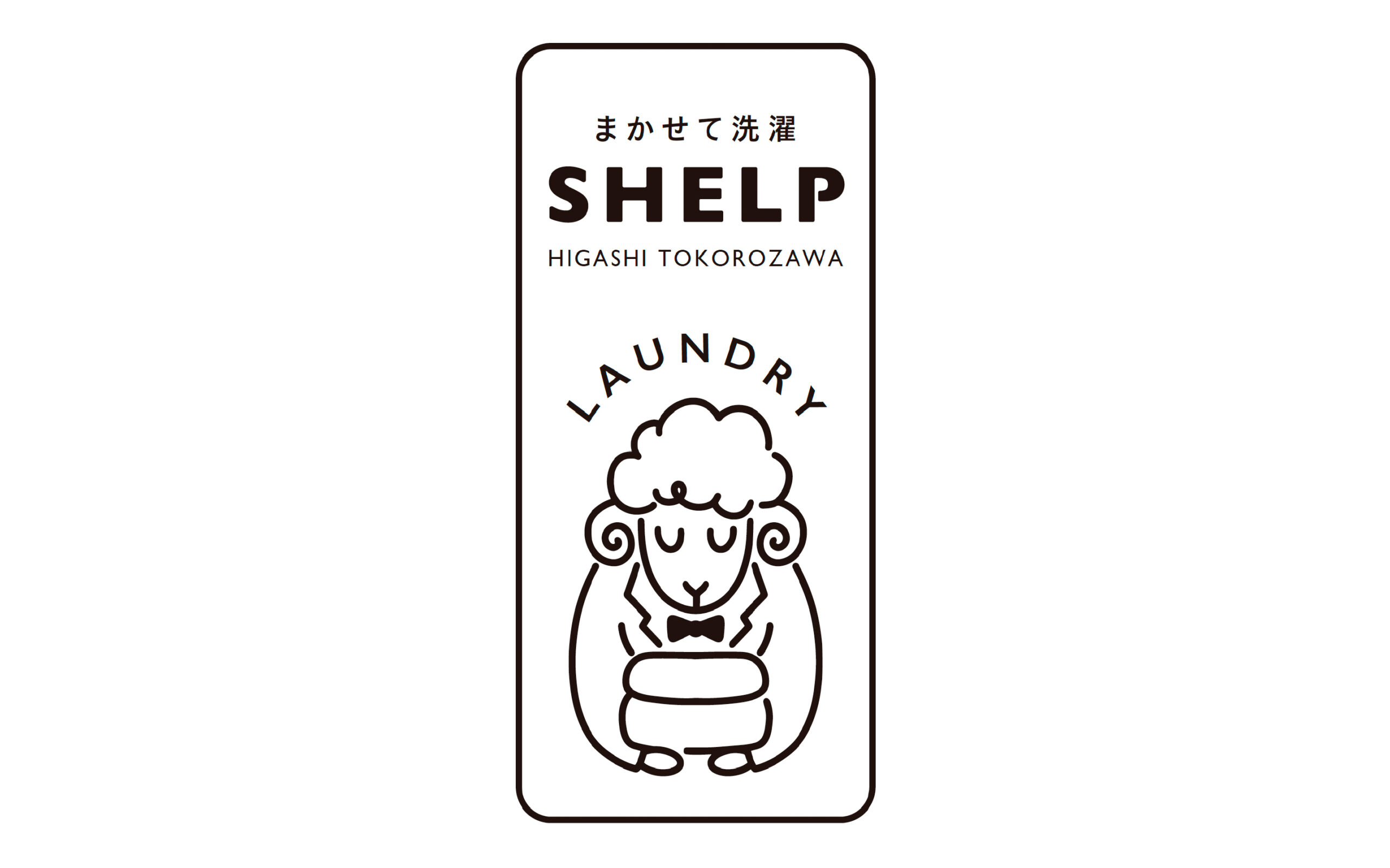
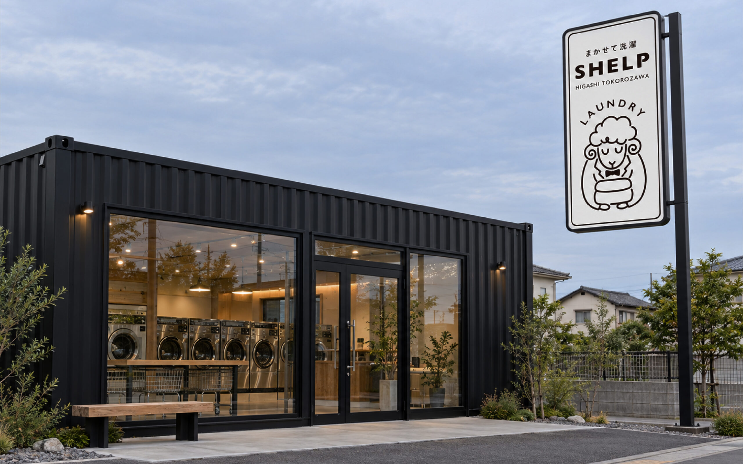
洗濯から乾燥、畳みまでを一括して任せられるサービス「SHELP」。ネーミングからロゴマークの制作までを一貫して担当しました。「HELP(助ける)」と「SHEEP(羊)」を組み合わせた造語は、日々の洗濯の負担を軽減するサービスの特徴を表現しています。名前に込めたのは、日々の洗濯を助ける頼もしさと、羊の毛並みのようにふんわり真っ白な仕上がりのイメージ。サービスの役割と、利用した先にある心地よさが、ひとつの言葉から伝わることを目指しています。ロゴマークでは、羊と執事を重ね合わせたキャラクターを設計。すべてを安心して任せられる存在を執事になぞらえ、蝶ネクタイと、畳んだ洗濯物を大切に抱える姿で、丁寧な仕事を表現しました。穏やかな表情と丸みのある線で、清潔感の中にもやさしさを感じる造形に仕上げています。モノクロームの明快な構成は、店舗の看板をはじめ、さまざまな接点への展開を考慮したもの。遠くからでも印象に残り、身近に感じられるブランドの顔を目指しました。洗濯を任せることで生まれる時間や、暮らしに戻ってくるゆとりまで。ネーミングとビジュアルを通して、毎日に寄り添うサービスの価値をかたちにしています。
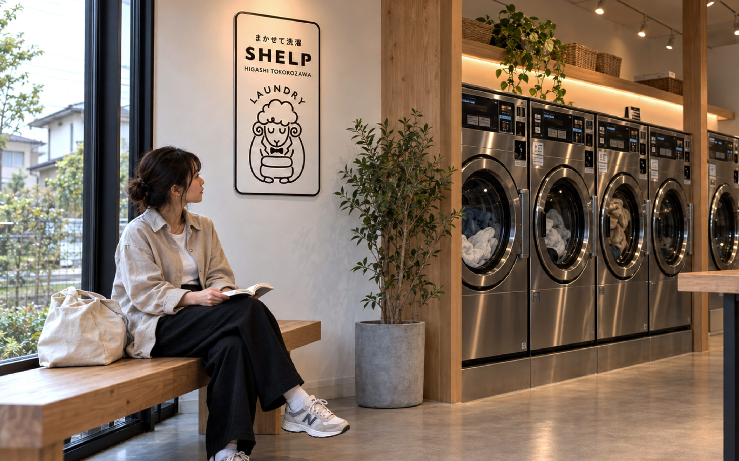
For SHELP, a laundry service aiming to handle everything from washing to folding, TIDE DESIGN proposed both the name and logo. SHELP combines HELP and SHEEP, linking everyday assistance with the image of soft, fresh white laundry. The logo brings a sheep and a butler into one character: a bow tie and carefully held folded clothes express dependable, attentive service, while a gentle face and rounded lines convey warmth and cleanliness. A clear monochrome design supports use across signage and other brand touchpoints. Together, the name and identity express the reassurance of leaving laundry in caring hands and gaining more time for everyday life.
Client: SHELP
Naming: TIDE DESIGN
Art Direction: TIDE DESIGN
Design: TIDE DESIGN
Illustration: TIDE DESIGN